


最新下载
热门教程
- 1
- 2
- 3
- 4
- 5
- 6
- 7
- 8
- 9
- 10
css sticky footer经典布局如何实现 css sticky footer经典布局实现代码
时间:2022-06-25 14:09:06 编辑:袖梨 来源:一聚教程网
本篇文章小编给大家分享一下css sticky footer经典布局实现代码,小编觉得挺不错的,现在分享给大家供大家参考,有需要的小伙伴们可以来看看。
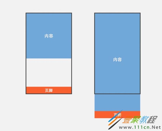
什么是sticky footer布局?
我们常见的网页布局方式一般分为header(页头)部分,content(内容区)部分和footer(页脚)部分。当页头区和内容区的内容较少时,页脚区不是随着内容区排布而是始终显示在屏幕的最下方。当内容区的内容较多时,页脚能随着文档流撑开始终显示在页面的最下方。这就是传说中的Sticky footer布局。
一般指手机页面中,当内容高度撑不满一屏时,页脚紧贴屏幕底部;当内容高度超过一屏时,页脚紧随其后。
方法一:flex弹性盒子布局
父容器container的display为flex,并规定项目排列顺序是纵向的
content元素的flex为1,即有多余空间就增大
footer定义一个高度
查看演示请狠狠地点击:flex弹性盒子布局实现sticky footer
内容
body {
  margin: 0;
}
.container {
  display: flex;
  flex-direction: column;
  min-height: 100vh;
}
.content {
  flex: 1;
  /*非必须*/
  width: 100%;

  line-
  text-align: center;
  color: #fff;
  font-size: 30px;
  font-weight: bold;
  background-color: #71a8da;
  /*非必须*/
}
.footer {

  /*非必须*/
  width: 100%;
  line-
  text-align: center;
  color: #fff;
  font-size: 30px;
  font-weight: bold;
  background-color: #f85f2f;
  /*非必须*/
}
方法二:padding-bottom+负margin-top
容器wrapper需要指定min-height为100vh(vh:视窗高度)
内容写在content容器里,指定padding-bottom为footer容器的高度
footer指定高度和margin-top,并且margin-top为高度的负值
查看演示请狠狠地点击:padding-bottom+负margin-top实现sticky footer
内容
body {
  margin: 0;
}
.wrapper {
  width: 100%;
  min-height: 100vh;
}
.content {
  /*padding-bottom应等于footer的高度*/
  padding-bottom: 60px;
  /*非必须*/
  width: 100%;

  line-
  text-align: center;
  color: #fff;
  font-size: 30px;
  font-weight: bold;
  background-color: #71a8da;
  /*非必须*/
}
.footer {
  /*margin-top应等于footer高度的负值*/
  margin-top: -60px;

  /*非必须*/
  width: 100%;
  line-
  text-align: center;
  color: #fff;
  font-size: 30px;
  font-weight: bold;
  background-color: #f85f2f;
  /*非必须*/
}
提示:两个/**非必须**/之间的部分不是实现sticky footer布局的必要代码,只是一些辅助样式,可以删除。
相关文章
- 价格跟踪交易-价格跟踪交易软件 04-25
- 碧蓝航线使用要注意什么 04-25
- 明日之后苹果能做什么食物攻略 04-25
- 以闪亮之名浅栗捏脸数据id攻略 04-25
- 逆水寒手游春归学堂奇遇如何完成 04-25
- 明日之后二层别墅建造蓝图攻略 04-25