


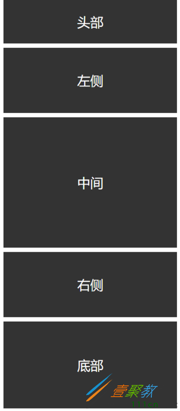
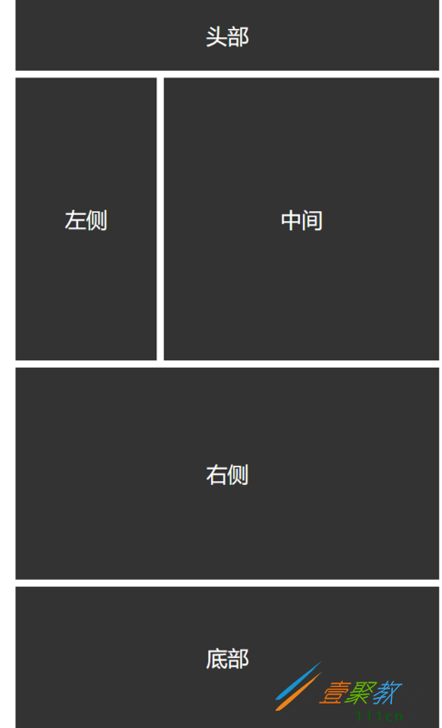
头部
左侧
中间
右侧
时间:2022-06-25 14:10:23 编辑:袖梨 来源:一聚教程网
本篇文章小编给大家分享一下CSS网页响应式布局实现自动适配Pc/Pad/Phone设备代码实例,小编觉得挺不错的,现在分享给大家供大家参考,有需要的小伙伴们可以来看看。
前言
现在的设备很多,有PC、iPad、手机、智能手表、智能电视。如果没有响应式布局,那么电脑网页在手机或者ipad上显示,是体验非常差,操作不方便,视觉疲劳的,所以我们开发网页要做好响应式布局。
index
响应式布局
css" href="style.css">
头部
左侧
中间
右侧
CSS
*{
    margin: 0;
    padding: 0;
}

/*适应PC端 宽度大于1000px*/
@media screen and (min-) {
    #content{

        margin:0 auto;
    }

    #header{
        width: 100%;
        line-
        float: left;
        background: #333;
        color: #fff;
        text-align: center;
        font-size: 30px;
        margin-bottom: 10px;
    }

    #left{

        line-
        text-align: center;
        background: #333;
        float: left;
        font-size: 30px;
        color: #fff;
        margin-right: 10px;
    }

    #center{

        line-
        text-align: center;
        background: #333;
        float: left;
        font-size: 30px;
        color: #fff;
    }

    #right{

        line-
        text-align: center;
        background: #333;
        float: right;
        font-size: 30px;
        color: #fff;
    }

    #footer{


        background: #333;
        color: #fff;
        line-
        font-size: 30px;
        text-align: center;
        float: left;
        margin-top: 10px;
    }
}


/*适应pad端 宽度在640-1000之间*/
@media screen and (min-) and (max-) {
    #content{

        margin:0 auto;
    }

    #header{
        width: 100%;
        line-
        float: left;
        background: #333;
        color: #fff;
        text-align: center;
        font-size: 30px;
        margin-bottom: 10px;
    }

    #left{

        line-
        text-align: center;
        background: #333;
        float: left;
        font-size: 30px;
        color: #fff;
        margin-right: 10px;
    }

    #center{

        line-
        text-align: center;
        background: #333;
        float: left;
        font-size: 30px;
        color: #fff;
    }

    #right{

        line-
        text-align: center;
        background: #333;
        float: left;
        font-size: 30px;
        color: #fff;
        margin-top: 10px;
    }

    #footer{


        background: #333;
        color: #fff;
        line-
        font-size: 30px;
        text-align: center;
        float: left;
        margin-top: 10px;
    }
}


/*适应移动端 宽度小于640*/
@media screen and (max-){
    #content{

        margin:0 auto;
    }

    #header{
        width: 100%;
        line-
        float: left;
        background: #333;
        color: #fff;
        text-align: center;
        font-size: 30px;
        margin-bottom: 10px;
    }

    #left{
        width: 100%;
        line-
        text-align: center;
        background: #333;
        float: left;
        font-size: 30px;
        color: #fff;
        margin-bottom: 10px;
    }

    #center{
        width: 100%;
        line-
        text-align: center;
        background: #333;
        float: left;
        font-size: 30px;
        color: #fff;
    }

    #right{
        width: 100%;
        line-
        text-align: center;
        background: #333;
        float: left;
        font-size: 30px;
        color: #fff;
        margin-top: 10px;
    }

    #footer{
        width: 100%;

        background: #333;
        color: #fff;
        line-
        font-size: 30px;
        text-align: center;
        float: left;
        margin-top: 10px;
    }
}
通过@media screen and (限制范围) 来控制网页的布局,例如
min-width代表最小的限制,max-width代表最大的限制。
PC端
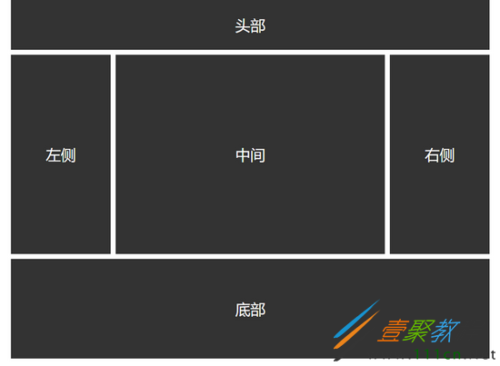
Pad端
Phone端